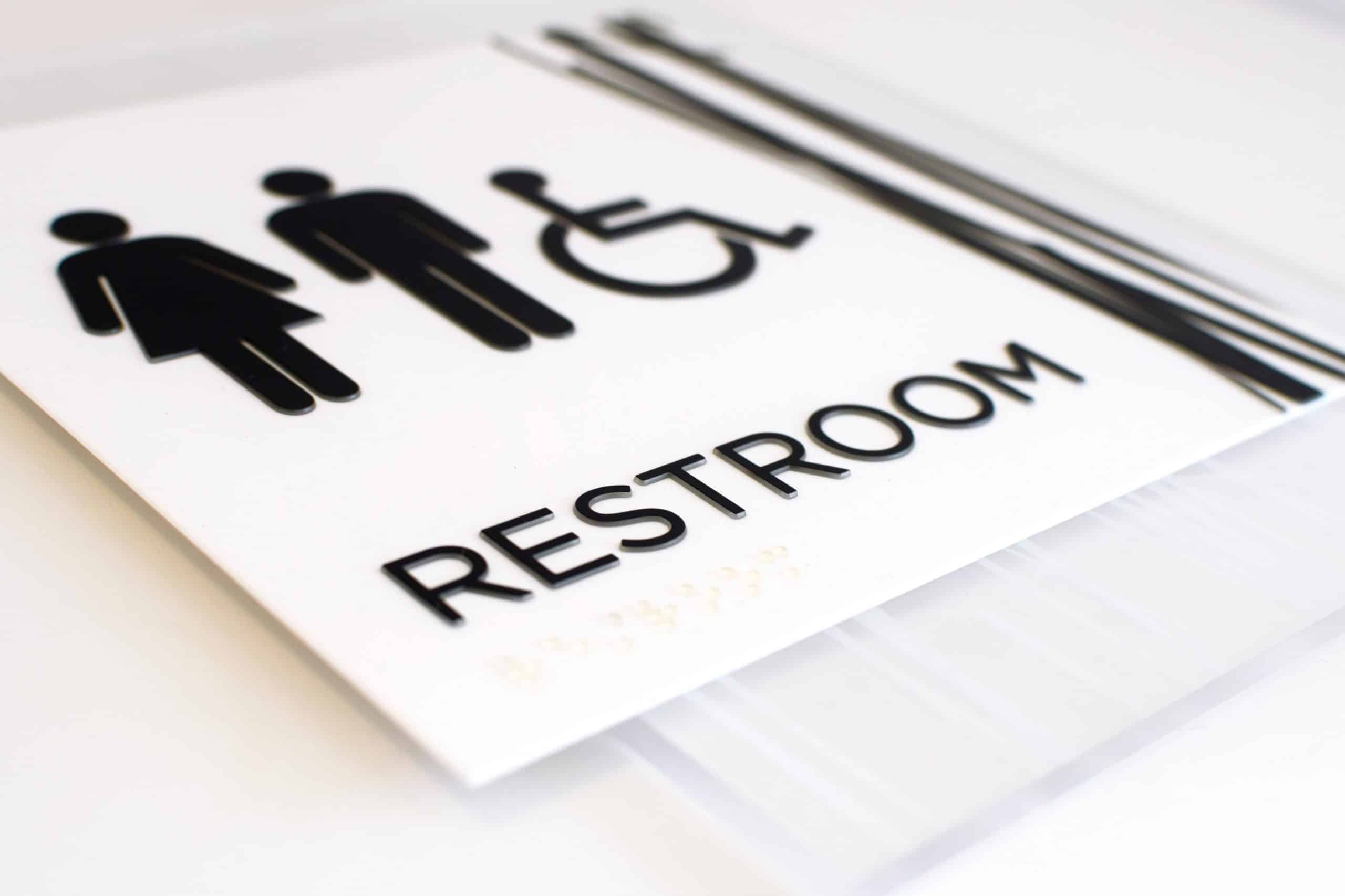
How to Achieve ADA Signage Compliance: Fonts
The Federal ADA signage guidelines can be difficult to navigate due to its complex and meticulous requirements. Our new series, “How to Achieve ADA Signage Compliance,” aims to empower sign manufacturers with the education they need to ensure ADA compliance for each sign they ship out.
The rules for ADA-compliant fonts on signage are very strict, relating to character style, size, case, height, and more. For each sign that is not compliant, manufacturers can face a fine of up to $150,000. To help you navigate this landscape, we have broken down everything you need to know about ADA-compliant fonts.
Font Style

Serif Font VS Sans Serif Font
Font style is one of the most common areas in which sign manufacturers fail to meet compliance. The ADA requires signage to have a specific font style wherein all characters must be styled in a sans serif font. According to the ADA, “characters shall not be italic, oblique, script, highly decorative, or of other unusual forms.” This is so that passersby can easily read what each sign signifies. If a sign is in any other font besides sans serif, it may be harder to read and understand what each sign means from a distance. Additionally, all fonts used in an ADA-compliant sign must be uppercase. This is so that persons with visual impairments can easily identify which letters are on the sign. Uppercase fonts also grab the attention of passersby better than lowercase fonts because they are easier to read. According to the ADA, all characters shall be selected from fonts where the width of the uppercase letter “O” is 55-percent minimum and 110-percent maximum of the height of the uppercase letter “I.”
When dealing with customers, sign manufacturers must protect themselves. If a customer wants to have a non-compliant font on their signage, make sure to have them sign off that they acknowledge that they were informed that the font is non-compliant. This will protect sign manufacturers and fabricators from fines and issues that may occur from non-compliance.
Font Size
The ADA is very specific about the font size for each signage. Currently, the ADA standard for character height specifies a size range for text height of ⅝ inches minimum to 2 inches maximum. This means that the text on each signage must be within ⅝ to 2 inches of height per line of text. For text that is larger, make sure to take into account, two times the height of the characters, plus 1 inch per line of Braille. This consistency helps make the words on the sign stand out and enables visually impaired people to read the sign without having to strain their eyes as much. However, many manufacturers often fall into error with this requirement because they do not allow enough room for both compliant Braille and tactile lettering. This also happens a lot with certain frame systems.
The exception to this rule is with the Dual Message Sign, one meant to provide the same information for sighted and visually impaired people. In these cases, the font characters can be as small as ½ inches high. To be exact, “where separate raised and visual characters with the same information are provided, raised character height shall be permitted to be ½ inch (13 mm) minimum.”

Character Spacing
Kerning, also known as the space between characters, is frustrating for many sign manufacturers because the ADA guidelines are restrictive. According to the ADA, character spacing should be measured between the two closest points of adjacent raised characters within a message, excluding word spaces.

Example of Character Spacing
There are two parts to this ruling depending on what types of cross-sections are used. Firstly, where characters have rectangular cross-sections, spacing between individual raised characters shall be 1/8 inches minimum and 4 times the raised character stroke width maximum. Secondly, where characters have other cross-sections, spacing between individual raised characters shall be 1/16 inches minimum and 4 times the raised character stroke width maximum at the base of the cross-sections, and 1/8 inches minimum and 4 times the raised character stroke width maximum at the top of the cross-sections. Additionally, all characters should be separated from raised borders and decorative elements at a minimum of 3/8 inches.
The reason for strict character spacing is that it helps those with visual disabilities trace their fingers along each letter and number to read the name of the sign. Additionally, there are not many people who are able to read Grade II Braille, so wider kerning is the most practical solution.
How to Ensure Signage Fonts Are Compliant
Font styles, sizes, and spacing may seem like an inconsequential matter in regard to ADA compliance, but they can result in negative consequences for a sign manufacturer of any size. Businesses can be hit with multiple ADA-related lawsuits or fines if a sign doesn’t have the appropriate font style, character spacing, or size as required by the ADA.
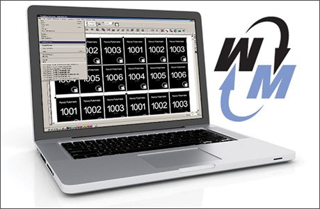 Nova Polymers’ Workflow Manager makes it easy for sign manufacturers to create ADA compliant signage in a streamlined way that saves both time and money. The highly automated software ensures braille placement, checks for non-compliance including fonts, and complies with federal standards.
Key Takeaways
The fonts used in signage are critical in ensuring ADA compliance. Sign fabricators and manufacturers of all sizes should be aware of the importance of font style, size, and character spacing. Addressing all these common font mistakes will allow signage businesses to be more confident in their sign-making process and achieve more profit in the long run.
Nova Polymers has the capability and experience to help you identify and solve all your font-related issues. For more information on the services we provide, contact us today.