Looking for an ADA sign fabricator? Browse trusted fabricators specializing in creating high-quality ADA signs.
American-Made Photopolymer Solutions
The Industry Standard System for ADA Sign Fabrication
Photopolymer has long been the industry standard for ADA-compliant wayfinding signs. As the maker of the only ADA-focused sign fabrication system, Nova Polymers provides the materials, equipment and support needed to make beautiful ADA-compliant photopolymer signs with confidence. With our extensive ADA knowledge, Nova is the go-to industry resource for architects and fabricators.
NEW AND IMPROVED: Novacryl® EX™ Series is the industry’s first pure exterior-grade photopolymer, designed for durability in high-moisture and high-humidity
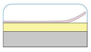
Moisture-resistant aluminum-backed photopolymer. Our brushed aluminum-backed photopolymer. The Novacryl® BR Series consists of the same interior-grade material as our PT
Moisture-resistant nylon-based photopolymer layer. Our aluminum backed photopolymer, the Novacryl® AL™ Series, is made of the same interior-grade material as
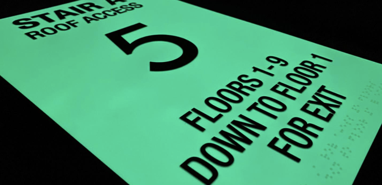
We’ve set the standard for innovation in accessible signage by creating the first clear photopolymer that is made to last.
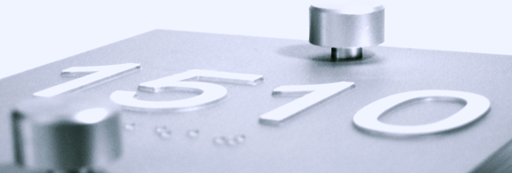
Choose the permanence of photopolymer signage. Unlike other ADA sign fabrication processes, our durable and long-lasting solutions withstand constant tactile contact, ensuring braille signs remain reliable. Trust in quality that endures for a truly inclusive and accessible environment for all.
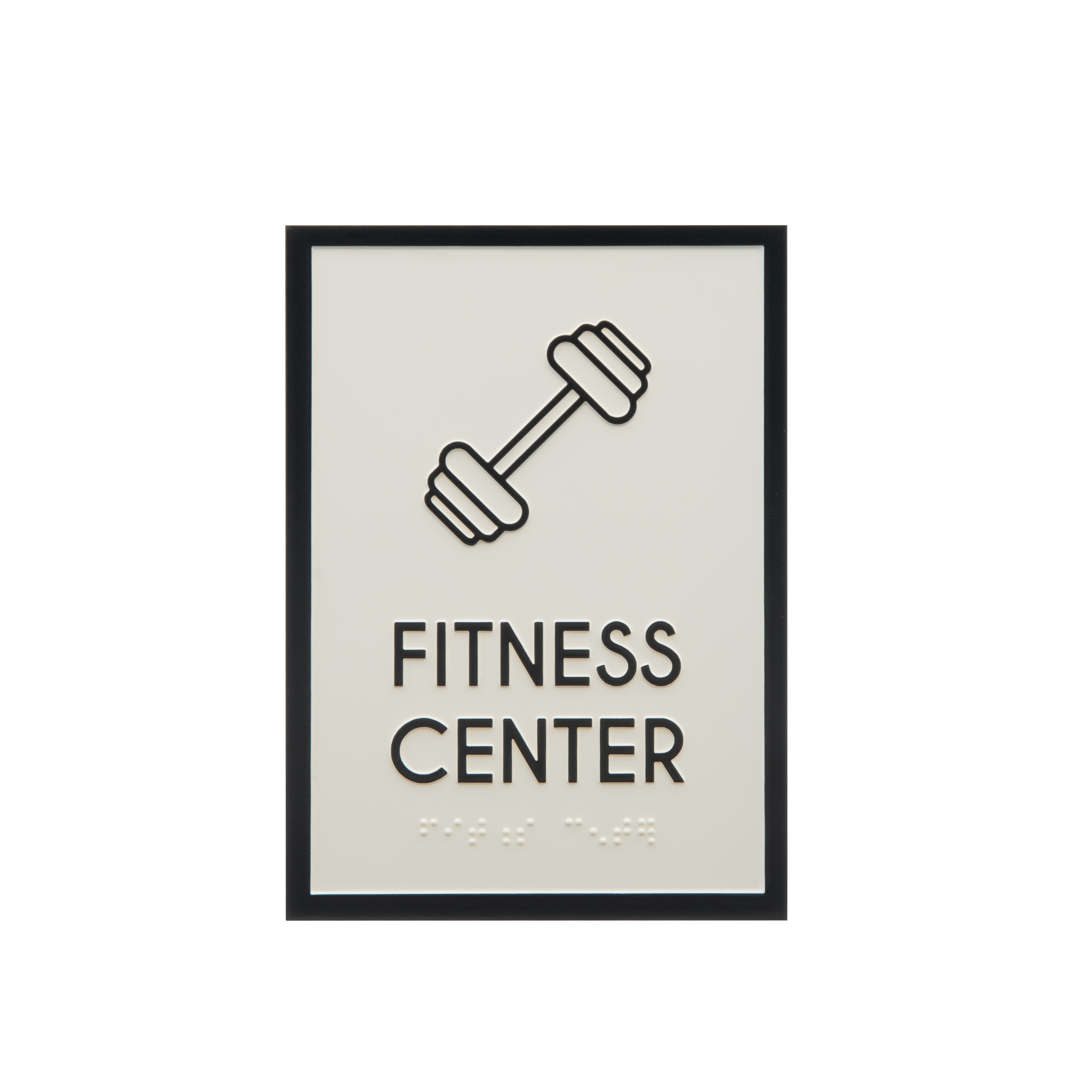
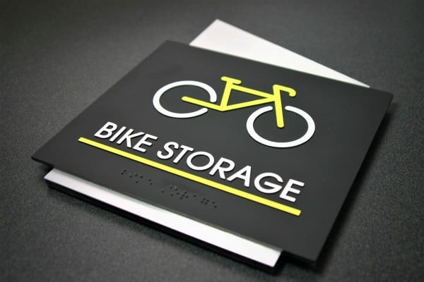
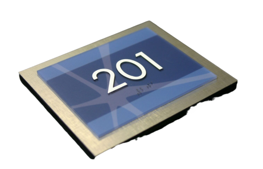
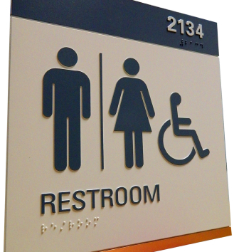
Our diverse range of photopolymer raw materials and technology allows for the design and fabrication of ADA braille and accessible room identification signage, including several products that help achieve USGBC/LEED certification.
Nova Polymers is your single source for innovative, environmentally conscious photopolymer signage equipment, material, and software solutions. Create branding through our materials and unlock the potential to make a lasting impact for all. And, when you need to brush up on training, Nova offers a free ADA (Sign specifications) webinar series for architects.
With financing options available,Investing in polymer ADA Braille sign production is a secure, materials-efficient choice for your business. Our design software minimizes the risk of human error and material waste. Improve your production capabilities and secure long-term support.
Nova Polymers is your single source for innovative, environmentally conscious photopolymer signage equipment, material, and software solutions. Create branding through our materials and unlock the potential to make a lasting impact for all. And, when you need to brush up on training, Nova offers a free ADA (Sign specifications) webinar series for architects.
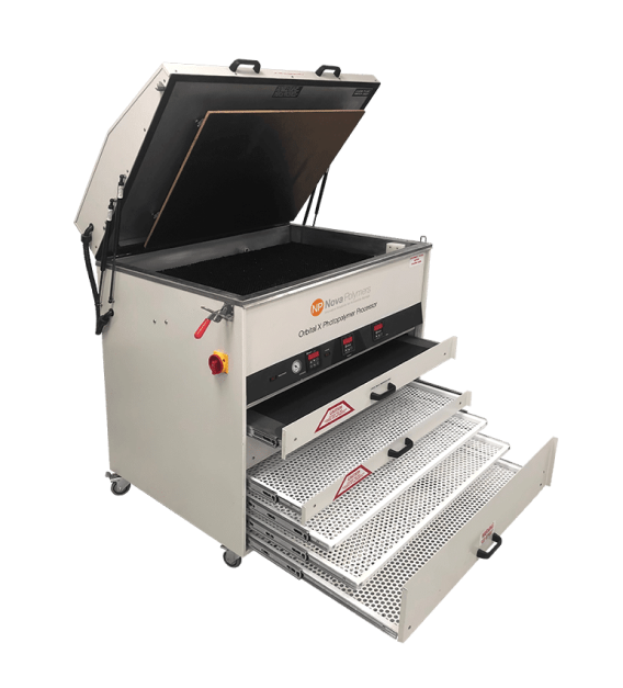
Processing Novacryl® photopolymer signs is easy and straightforward, resulting in high-quality ADA compliant braille and accessibility room identification signage.
At Nova, we make this process easy to follow and understand. There are five simple steps, and we provide all the resources necessary to process correctly and ensure ADA compliance.
Our Novacryl Processing Guidelines will walk you through the details associated with actual processing time and procedures.
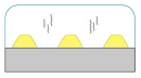
Step 1
Contact With Film Negative
Place a high-density film negative on top of the photopolymer sheet.
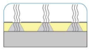
Step 2
Exposure with UV Light
There is a bank of UV lamps that shine down and pass through the clear areas of the film negative and expose the photopolymer material.
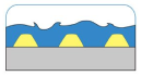
Step 3
Wash in Plain Tap Water
The unexposed photopolymer gets washed away during the washout process in plain tap water. The photopolymer effluent is 100% biodegradable and goes right down the drain. You are left with the exposed raised images.
Step 4
Drying
Dry the moisture off the material. The photopolymer and the base PETG do not absorb moisture during the washout – drying is to evaporate any standing moisture left on the sheet.
Step 5
Post Exposure
Post exposure is a second exposure to fully cure, harden, and activate the photopolymer. This is the final step in processing the photopolymer.
Color Pro Ink Tipping Machine
The Nova Polymers’ Color Pro is a game-changing solution for sign makers who want to increase their ink tipping processing and speed.